It’s time for another round of my favorite tours…the Blogger Styling Home Tours and the theme this time is Work & Play. My friend Lindsay from The White Buffalo Styling Co. gathers up a group of some of the most talented bloggers (I get to be included, what?!) to open their homes and I love getting peeks inside! So, hi new friends from Primitive and Proper! If you want to find out a little more about me I suggest checking out my “About” page up there. If you’re just looking for the pretty pictures let’s go…..
This tour lined up perfectly with my revamp of my guest room/office. I revealed the most recent makeover of this room here. It had a lot of things that I loved but the furniture wasn’t the right fit. We had an extra long desk that was made using a butcher block countertop from IKEA and as much as I loved the look, the truth of it was we just never both sat down and used it. That’s a large piece to take up space without actually being used. I also tired of the grey paint color. Overall I just felt like the space needed more air, more light, more breathing room. So here were my original plans:
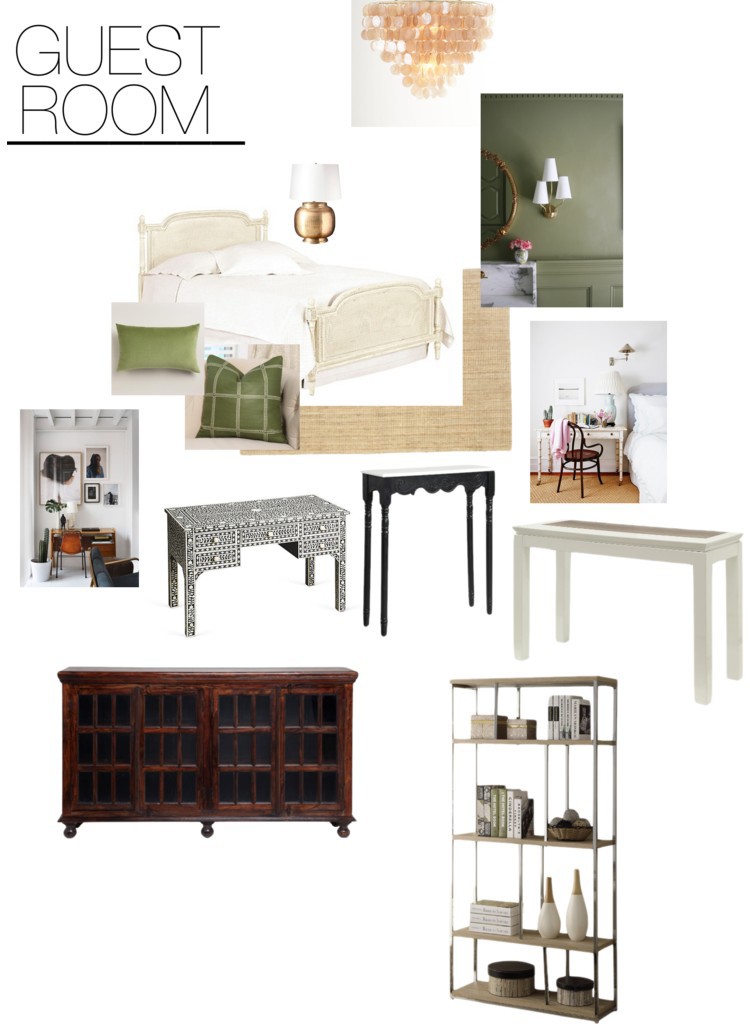
If you notice these plans feel a little more dark and cozy, not so light and airy. You can see how my plans changed and progressed in this update. Due to budget and my ever-changing whims I swapped out the bed, desk, and color scheme. One main thing is I decided to go a lighter route with the paint.
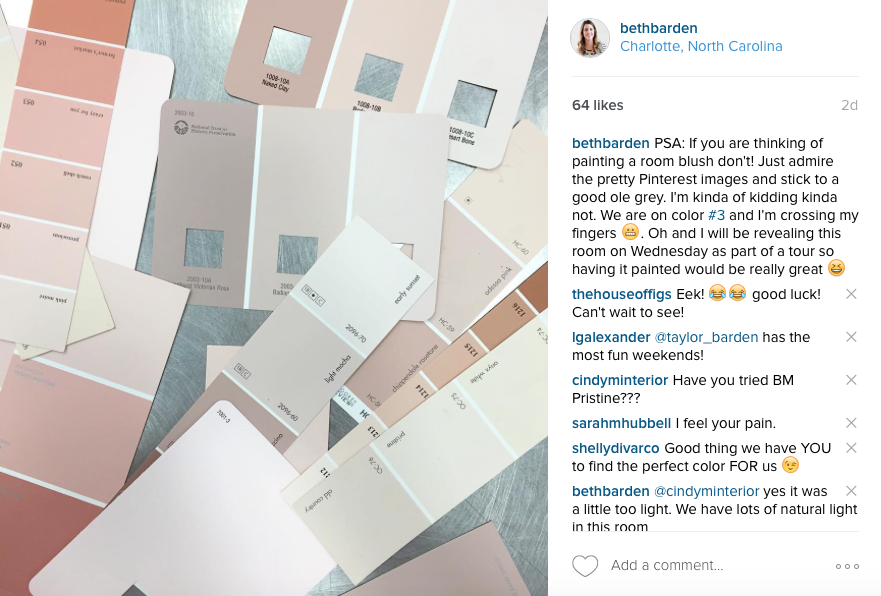
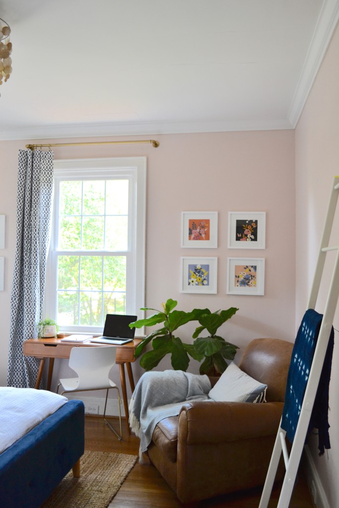
This started the paint decision that would take over my life for three weeks. I tried sample after sample and reached out for help on Instagram. I forced my kids to weigh in and ultimately decided on the perfect blush, Champagne Glee by Valspar. (I think I will do a whole post on blush paints soon!) So with the perfect color I moved on to the fun part of decorating and rearranging and here is where it stands today…
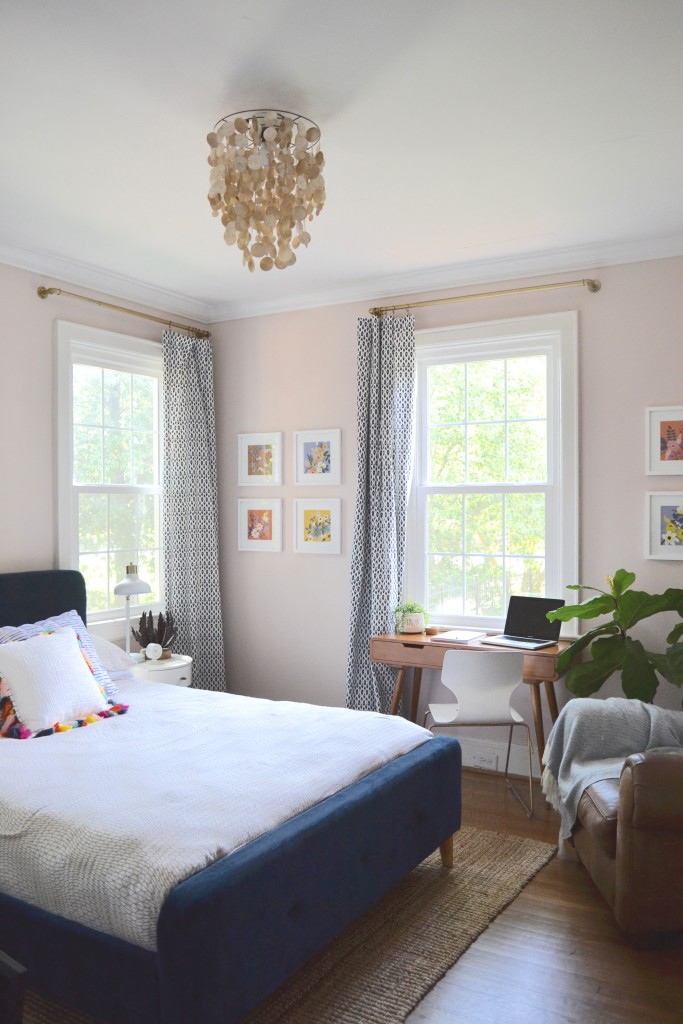
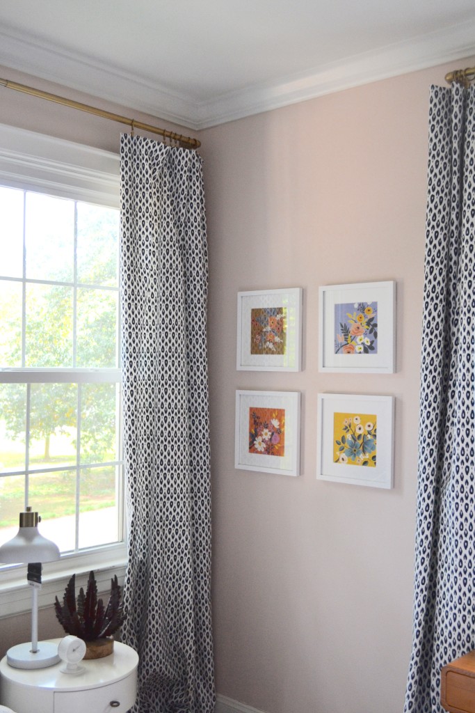
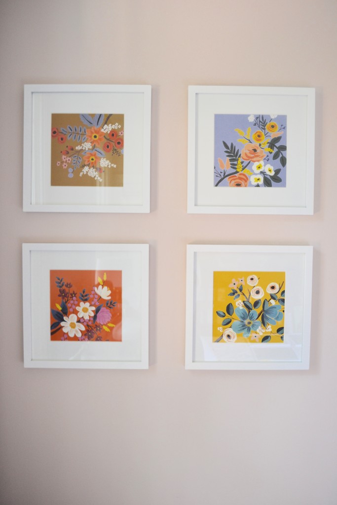
I relocated my Rifle Paper Co. calendar because it is one of my favorite things ever. I cut and framed the pages and created these grids on either side of my desk.
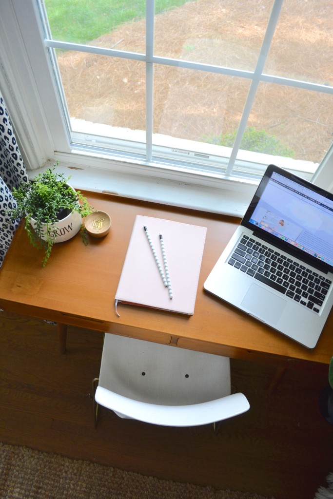
I absolutely love my new view! I can watch the birds, the cars go by, or my kids playing soccer.
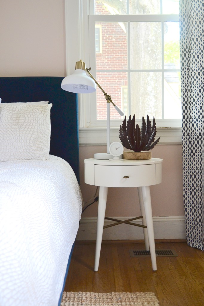
One thing that was lacking in this room was a pair of matching nightstands. I snagged these when they went on sale and I love them! I haven’t decided yet if I am going to get another task lamp or keep this mis-matching pair. Thoughts??
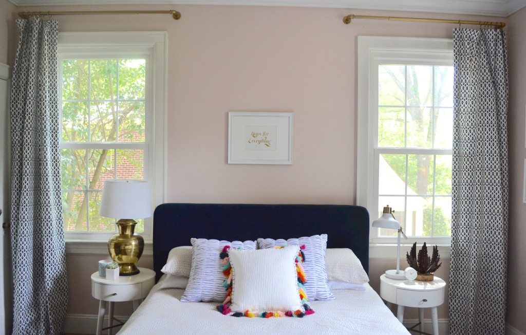
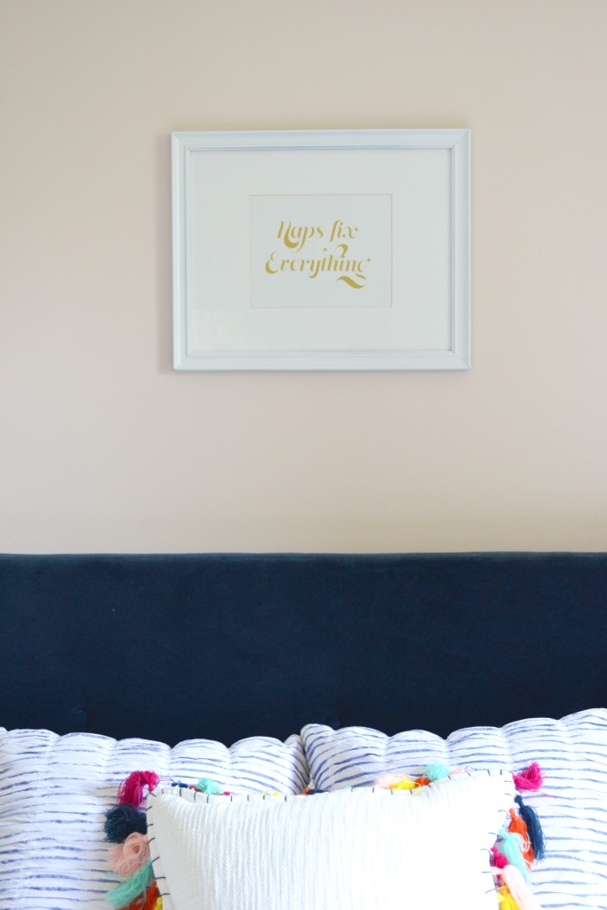
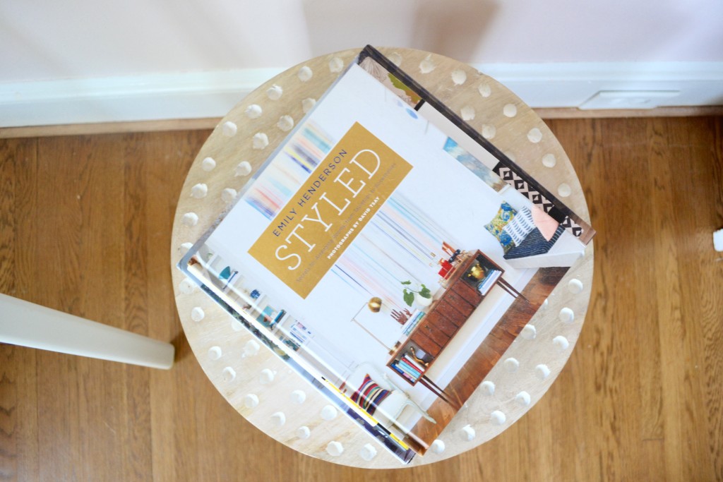
This print stayed because, well, I still think it’s the best advice out there….
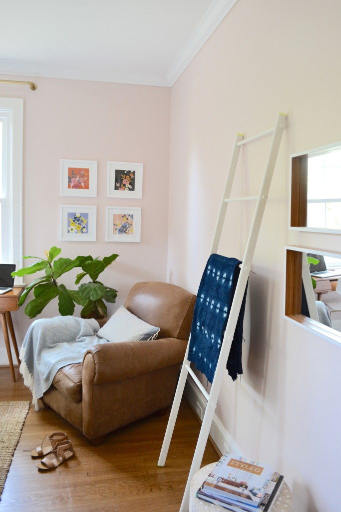
On the opposite wall the plan was to add bookshelves but I decided to hold off on those for now. I have several pinned that I love but I am really torn on whether I want to do a freestanding piece or wall-mounted system. I love the idea of more storage and a place to play stylist, but I also like the space right now. This is new to me but I am going to just sit on this decision for awhile and see how we use the space. #adulting
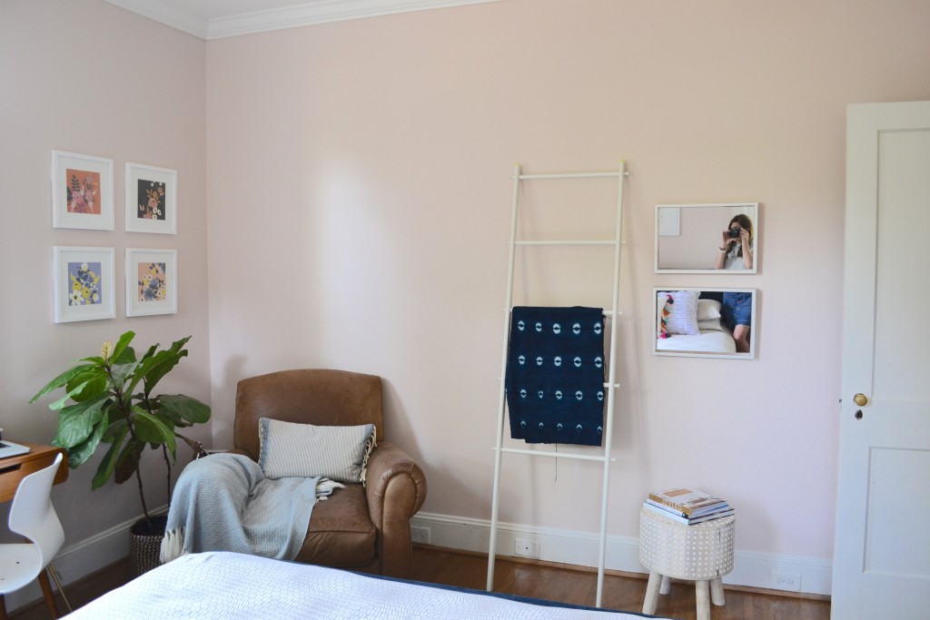
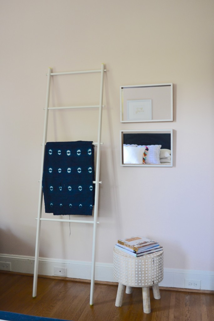
For now this ladder and stool make me happy.
One last look…
And don’t forget to hop over to My Fabuless Life now to continue through the tour!
Get The Look
Duvet cover || Tassel pillow || Seersucker pillow || picture frames || Similar Floral Art || Desk || Bed || Nightstands || Desk Chair (thrifted) || Stool || Lamp || Brass lamp (thrifted) || Curtain Fabric **60% off just today || Curtain Rods (spray painted gold) || Ladder (similar) || Rug
Affiliate links used
Monday, April 18th:
The White Buffalo Styling Co.
Emily A. Clark
Cuckoo 4 Design
Bliss at Home
Iron & Twine
Nesting with Grace
Tuesday, April 19th:
Place of My Taste
The Chronicles of Home
Life on Virginia Street
Bright Green Door
Our Storied Home
WithHEART
Wednesday, April 20th:
Jones Design Company
The Wicker House
Primitive & Proper
DesignPost Interiors
My Fabuless Life
The House of Silver Lining
Thursday, April 21st:
Thistlewood Farms
Simple Stylings
Restless Arrow
Katie Gavigan Interiors
Claire Brody
Friday, April 22nd:
Hi Sugarplum
The Décor Fix
A Designer at Home
Style Mutt Home
A Creative Day Blog
Style Your Senses
LOVE this and the lighter pink with the blue feels very you! love that wall color! and i think i like two task lamps instead? 🙂
Fine then I’m telling Taylor you MADE me spend the extra money on that lamp…along with everything else that ends up in my cart while I’m there 🙂
It looks amazing, Beth! I love the color – so pretty and soothing and adore the prints from your calendar! Great job!
Thank you!!
I love it and am obsessed with he hassle pillow. And I’m a sucker for symmetry so I’m going for matching pair of lamps too.
GIRL!!! It looks amazing! I love the blush especially with the navy! I’ll be over next week to check it out 🙂
Well now i think I need to paint one room blush!!! Also those brass curtain rods… swoon! Such a gorgeous room, I pinned almost all the images! Thanks!
What a pretty room, Beth! I have my desk looking out a window too and I just love that view. It’s almost as good as working outside. Almost 😉 And naps sure do fix everything!
They helped pick a beautiful color and what an inspiring view for you!
Love this freshened up space, girl! Thanks so much for joining in!
I’m sorry- I assume followers may already know this but where’s the leather cognac chair from? Thanks!!!
Guest room looks pretty awesome. I like the way it appears!
Nourison Modern Area Rug