Well, here we are again at my new favorite day of the week. Who knew Tuesdays would become so exciting, but with this new series I cannot wait to see what is in store each week! Today we have one of my favorite bloggers. I know everyone says that about everyone who visits their blog, but I really really love Heather!

I found her blog a long time ago and have always loved her style. I was so happy when she decided to make the venture into her own design business because I always find inspiration from her and I knew she would bring so much to the design world! After seeing her designs below I am officially panicky about my actual rug choice. I was embarrassed at how much time I spent looking through the rugs on RugsUSA’s site and felt sure I had seen every.single.one but this one is brand new to me and I love it.
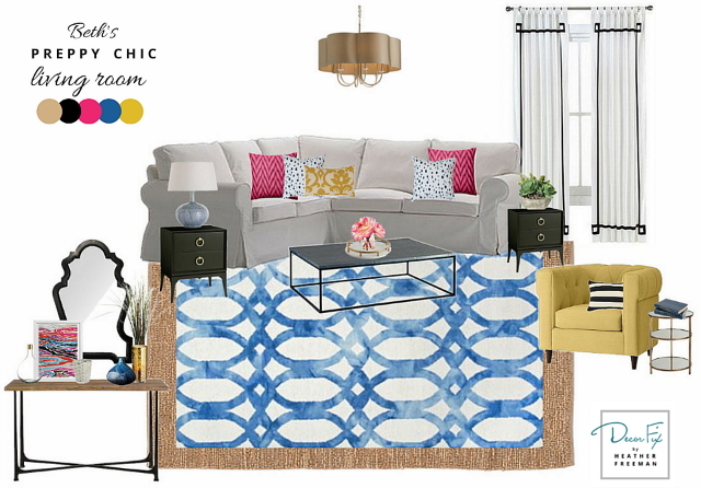
Beth has such a great “blank canvas” to start with. The pieces she already has are transitional but could be styled so differently based on what you pair them with. For inspiration, I “looked around” Beth’s home to see what she gravitates toward. I noticed lots of geometric prints, bold pops of color, and a healthy use of black throughout her home. (All things that I love!) This was the starting point for the design. Maybe you’ve noticed that blue is having a serious moment in the decorating world lately. Indigo is every where and cerulean, deep teal, and classic navy are in heavy rotation all over the interwebs. Honestly I used to gravitate more towards green, but lately I’ve been loving all things blue and even updated my own master bedroom using navy.
THE PLAN
Based on Beth’s style and my current color crush, I picked a blue and white geometric rug to layer on top of her jute rug. I thought the contrast of neutral and earthy with bold and preppy would make for a fun rug combo. This particular rug, the “Dip Dyed Blue” from Rugs USA, is so unique because instead of a purely saturated hue, the blue almost looks like a watercolor. This effect allows that beautiful variation of color and brings an understated elegance to a pattern that might otherwise feel more severe.
I then found the black side tables with gold pulls to add a little sophistication and work with her current coffee table. (PS-If ever you see a piece of furniture that looks a little blah, just remember that pulls act like “jewelry” and can totally transform the look.) The Greek key detailed drapes and mirror feel a bit posh and a bit preppy at the same time. In order to keep the room fun, I thought hot pink pillows would add a good pop of color. The yellow tufted chair is one of my very FAVORITES from West Elm right now. It gets a little black and white striped pillow to tie it in to the rest of the room. Lastly, I wanted more tan to the color story to match the jute rug. The chandelier was perfect for this because the color is nice and neutral, but the shape of the shade fits with the “preppy chic” theme of the room.
THANKS & THOUGHTS
Thanks to Beth for inviting me to participate in her fun series:) I love collaborating with talented ladies, especially those who speak my design love language. It’s funny how sometimes you “meet” people online and immediately think, “Oh, we’d totally be real life friends.” That’s one of the joys of blogs, connecting with and meeting people you might never have met any other way. Please feel free to drop by “my place” and visit for a bit.
Rug| Chandelier | Yellow Chair | Mirror (similar to one used) | Console Table | Side Tables | A DIY for similar drapes | Abstract Art | Pink Pillows | Spotted Pillows | Yellow Lumbar Pillow
So, I need to do several things….exchange my rug (kidding, kind of), purchase that yellow chair, and then give Heather a big fat smooch for putting this plan together! I can definitely tell she “peeked around” my house because this room totally fits the vibe going on here. Thank you so much Heather! Make sure y’all visit her blog. There is so much good stuff: design tips, quick spruce ups, and her fresh and perfect styling! And if you have missed any in the series so far, catch up here:
I really think this series is making more work for you… how are you ever going to choose which design to use? 😉 You'll just need a house with 10 living rooms to decorate.
Thanks, Beth! I second what Jennifer said…
wow- heather knocked it out! i don't even know how to make a proper mood board so mine won't look half as good!
I'm loving checking out all the inspiration from all these talented friends!
Oh, just gorgeous! I love the color combinations with the yellow, bit of pink, blue and white and a touch of black!
I just looove this mood board!